Special K Bars
A unified portfolio that balances taste and benefits
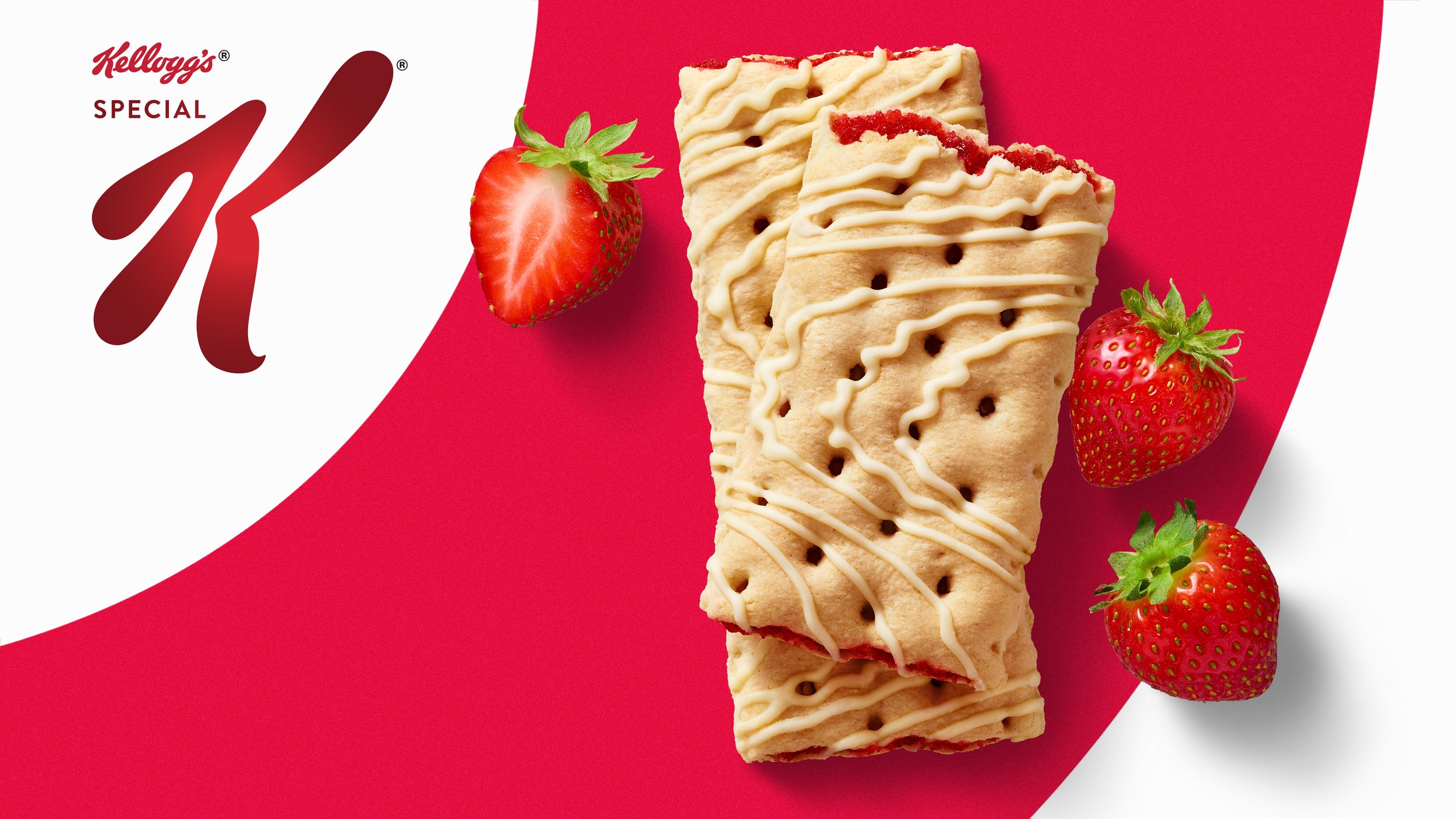
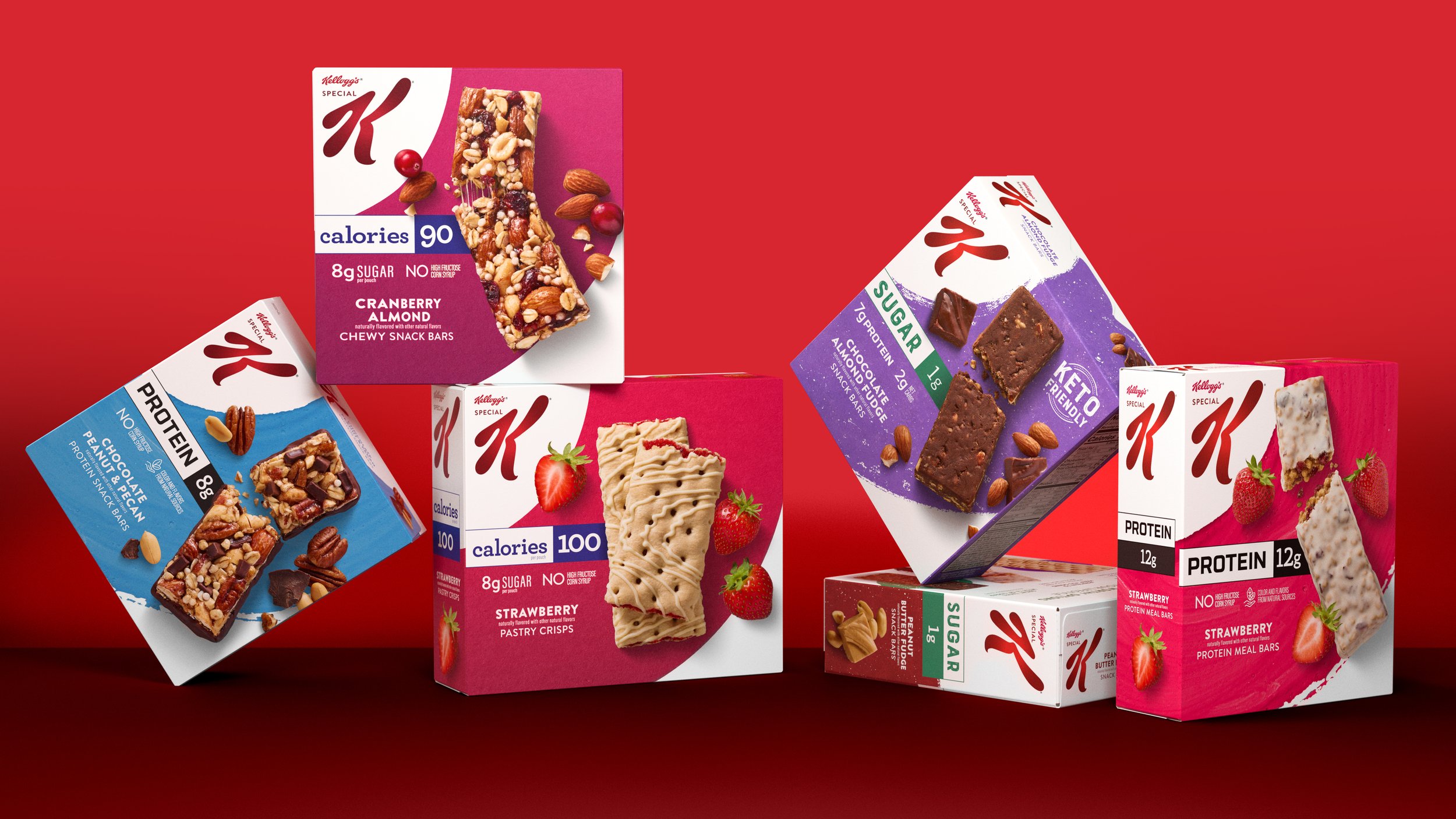
Special K known for great-tasting healthy cereal knew women shopping in the snack bar aisles wanted an offering beyond great taste; they were seeking functional benefits too! To meet this demand Special K set out to leverage its equity in weight management with a portfolio redesign aimed to clarify product proposition, improve navigation, and generate standout within in a confusing and crowded shelf.
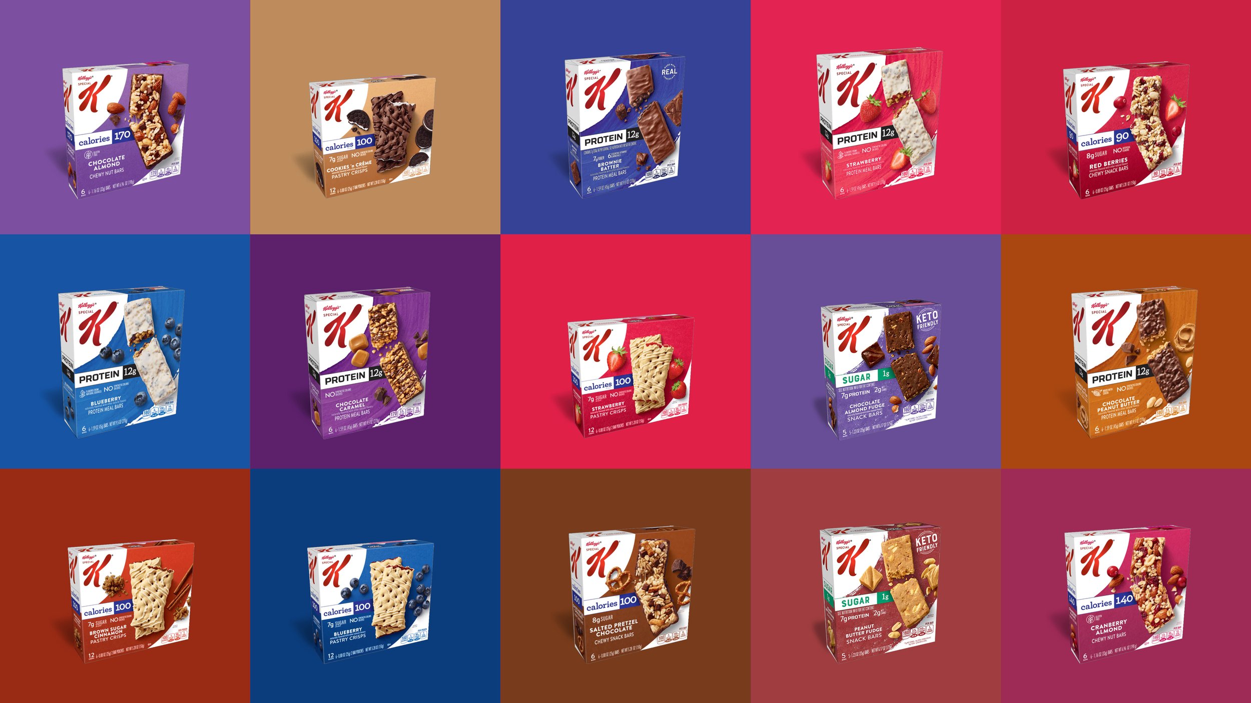
The new design system visualizes the portfolio architecture with a simplified pack to increase shelf block and purchase intent. Bold shape and color link to the visual equity of Special K Masterbrand creating a halo to the brand’s history in great-tasting, health-conscious products. To ensure success at the shelf strategically leveraged snacking category codes and benefits were brought to the forefront of on-pack visual and verbal communication.
Scope: Portfolio Architecture, Naming, Packaging, Photography, Guardianship
Role: Creative Director, Dragon Rouge
Design Contributors: Martin Yeo, Claire Lieber, Gabby Lequerique
Photography: Kevin Smith
Renders: Omar Bouras


