Clear Eyes
See and Feel a brand transformation
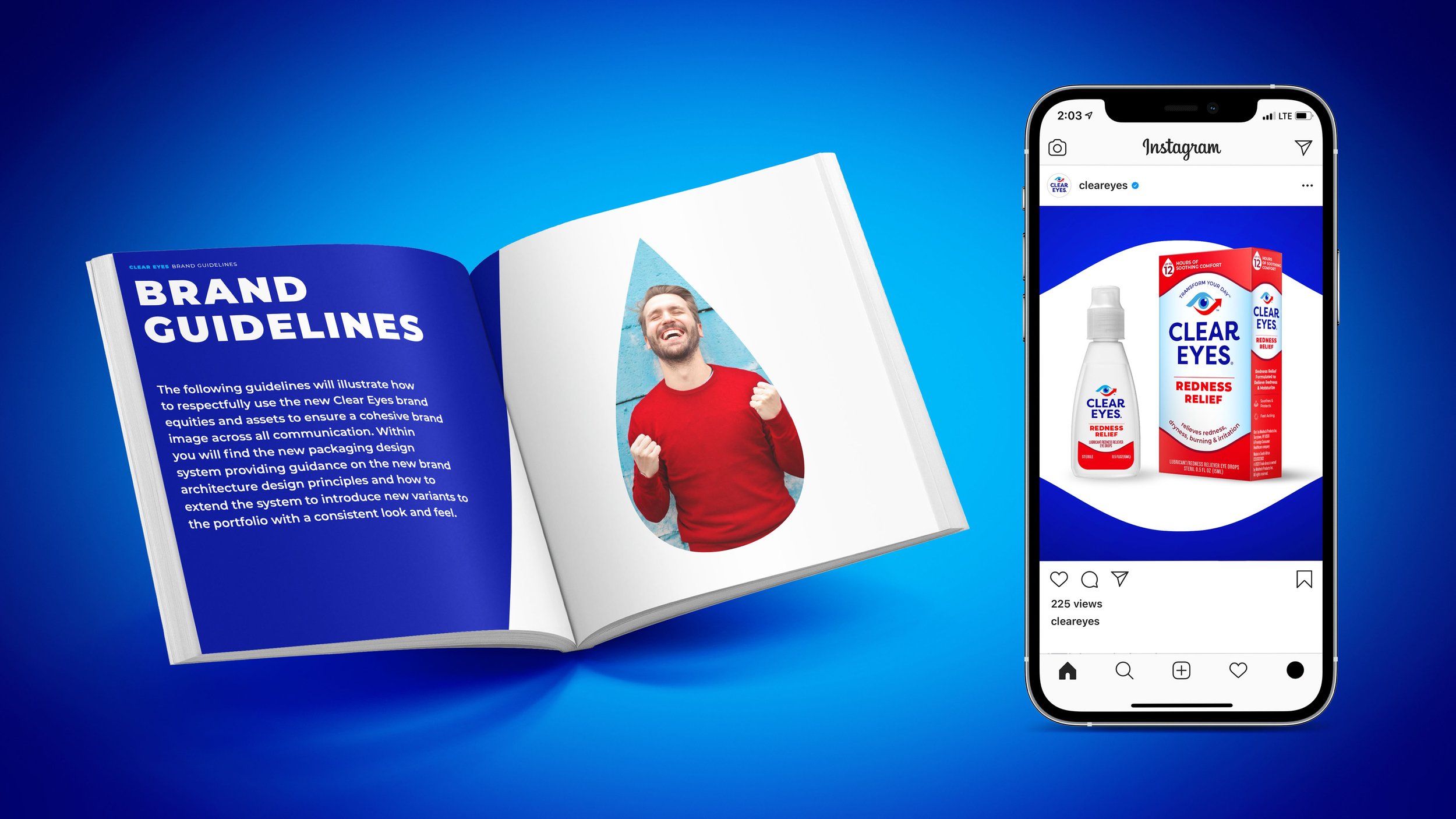
In recent, the eye drop category like many other consumer spaces has faced increased competition from established and challenger brands. As a result, Clear Eyes the #1 eye drop brand for decades recognized the need to modernize the verbal and visual brand world to maintain relevance, appeal, and leadership for decades to come.
In response, a new brand foundation was established to drive category and brand growth by evolving the #1 redness relief brand from a functional to an emotional one with a payoff you can see and feel. The new brand identity and packaging visualize the brand foundation by strategically evolving key equities and deploying codes and cues inspired by beauty. To improve navigation, and stand out every element within the brand toolbox was transformed to strengthen and celebrate the brand’s visual assets and leadership in the category.
Scope: Brand Foundation, Naming, Portfolio Architecture, Claims, Identity, Packaging, Digital Assets, Guardianship
Role: Creative Director, Dragon Rouge
Design Contributors: Adam Lehman, Gabby Lequerique, Vivi Florez
Renders: Omar Bouras


